

Original demonstration · Not client work
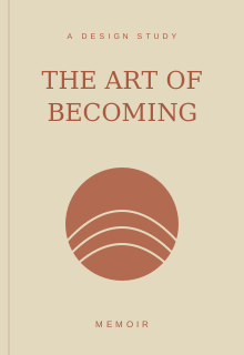
The art of becoming
A memoir cover study using restrained typography, paper tones, and an abstract landscape.
Original demonstration · Not client work
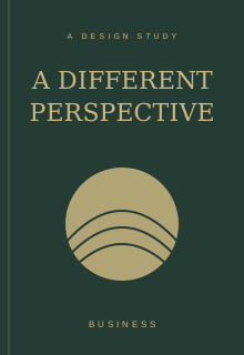
A different perspective
A business-book direction with deep green, warm metallic tones, and a clear title hierarchy.
Original demonstration · Not client work
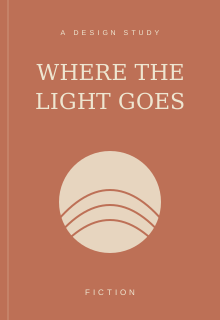
Where the light goes
A fiction concept built around atmosphere, a warm palette, and an evocative composition.

Original demonstration · Not client work
The editorial eye
An illustrated study of the revision process: clarity, consistency, and thoughtful author queries.

Original demonstration · Not client work
Room to read
A visual study of page rhythm, margins, chapter hierarchy, and a comfortable reading experience.
Original demonstration · Not client work
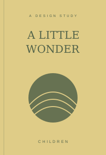
A little wonder
A playful cover direction for a younger audience, using simple shapes and a welcoming palette.